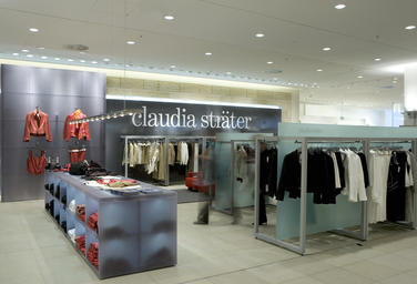
Claudia Sträter, Stuttgart DE
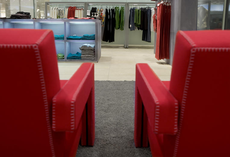
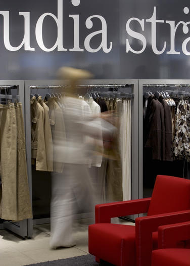
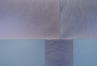
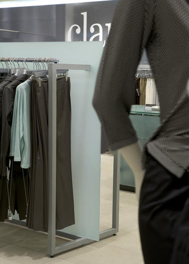
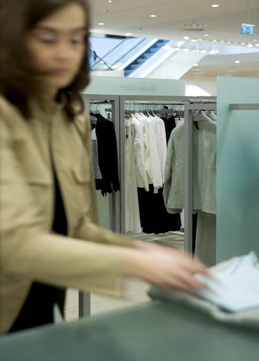
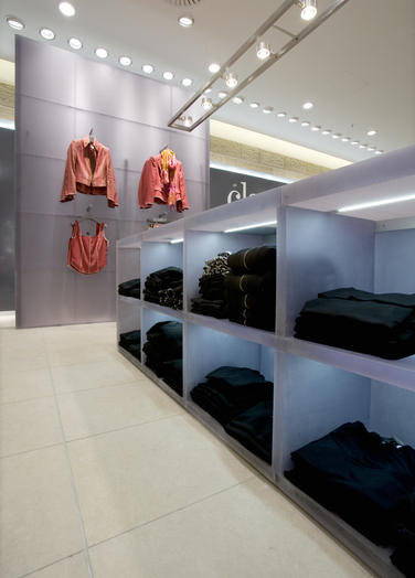
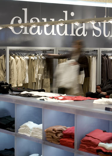
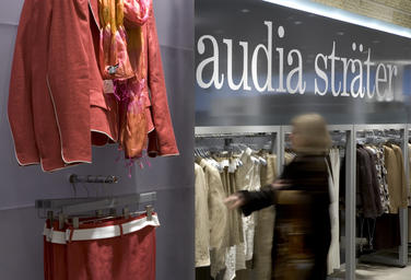
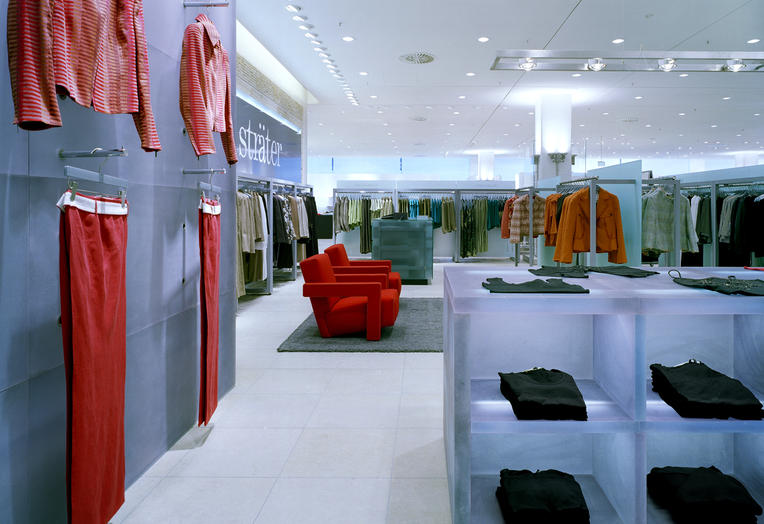
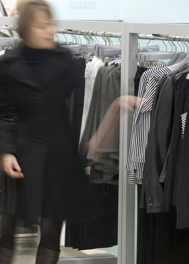
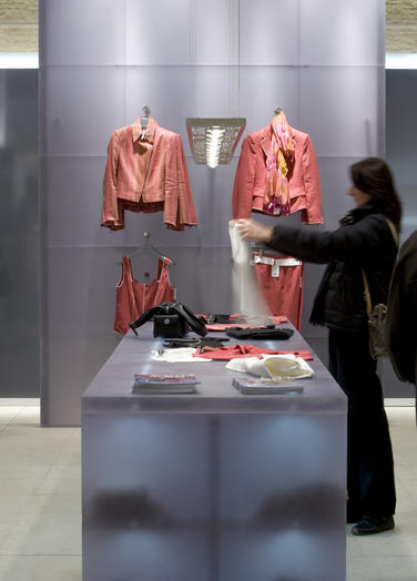
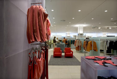
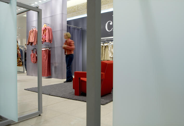
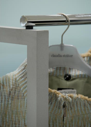
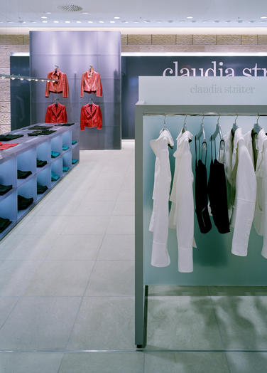
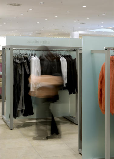
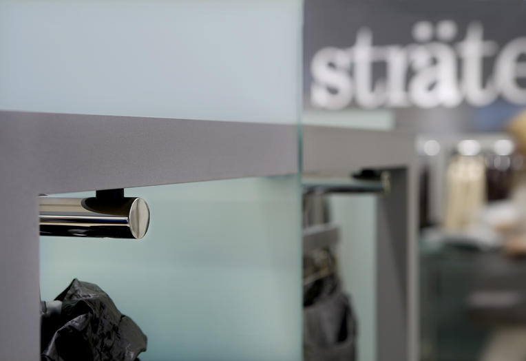
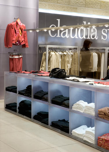
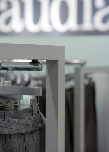
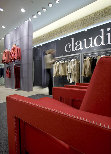
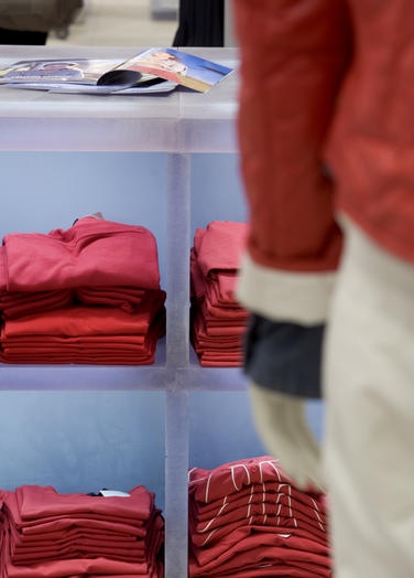
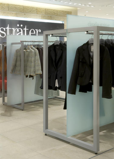
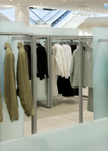
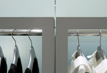
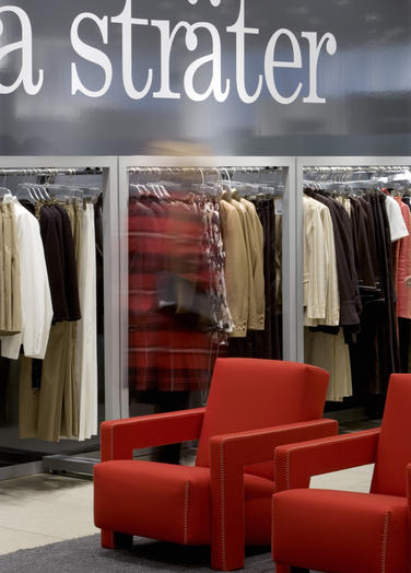
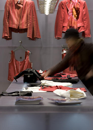
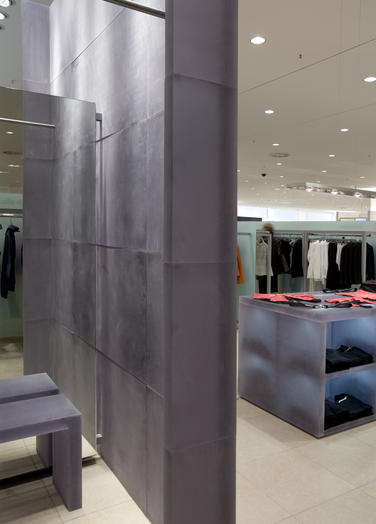
In 2001, the requirement arose to present the Claudia Sträter brand internationally in departments stores in Northern Europe, by using a shop-in-shop concept. The concept is clearly and spaciously designed. The materials, subdued colours and finishings radiate self-awareness and personality in comparison to the competitive brands.Robust blocks of polyester, roughly scoured and translucent purple are used as construction material for the presentation wall and presentation table. There are sturdy racks of square tubing with a light-grey suede coating, and a back wall of plastic in a subtle green colour. Two red armchairs from Gerrit Rietveld are the only extravagant highlights of colour. The free-standing presentation wall catches the eye from afar. A large, dark-grey, high-gloss back wall with a heavily enlarged white logo amplifies this signalling effect. Racks with high back panels or partitions enclose the shop. A long display table leads the customers into the shop. For each department store, a floor plan is designed that is tailored to a specific situation. In this space, the customer feels beautiful and can leisurely walk around in a collection that is optimally presented by the shop-in-shop concept.
Architect: Liesbeth van der Pol / Jon Dekker
Team: E. Wolse
Number: 0422
Status: Built
Year: 2004 - 2004
Client: Claudia Sträter Modehuizen bv, Diemen
